


A Slow Stir: Color Experiments and Risotto
Tips on painting with historical palettes and a risotto recipe.


Lately, I have been indoors, prepping for upcoming Winsor & Newton demos, my classes, and revisiting historical palettes. I am exploring how different color sets work for oil painting—testing mixes, value ranges, and color harmony. These exercises test and expand my knowledge of art history, the evolution of pigments over time, and my own mixing ability.
Studying historical palettes also offers other benefits. Working with fewer, unusual, or more muted pigments improves mixing skills and sharpens color discipline. Winsor & Newton has been reintroducing some older colors from their original early 19th-century lines recreated in modern pigments that are safer, more permanent, and lightfast. Many of these colors had not been available for many decades, so this provides a new opportunity to experience painting in the manner of artists like Thomas Eakins or Georges Seurat. Many older palettes were designed with tonal contrast in mind, making them especially useful for building value structure.
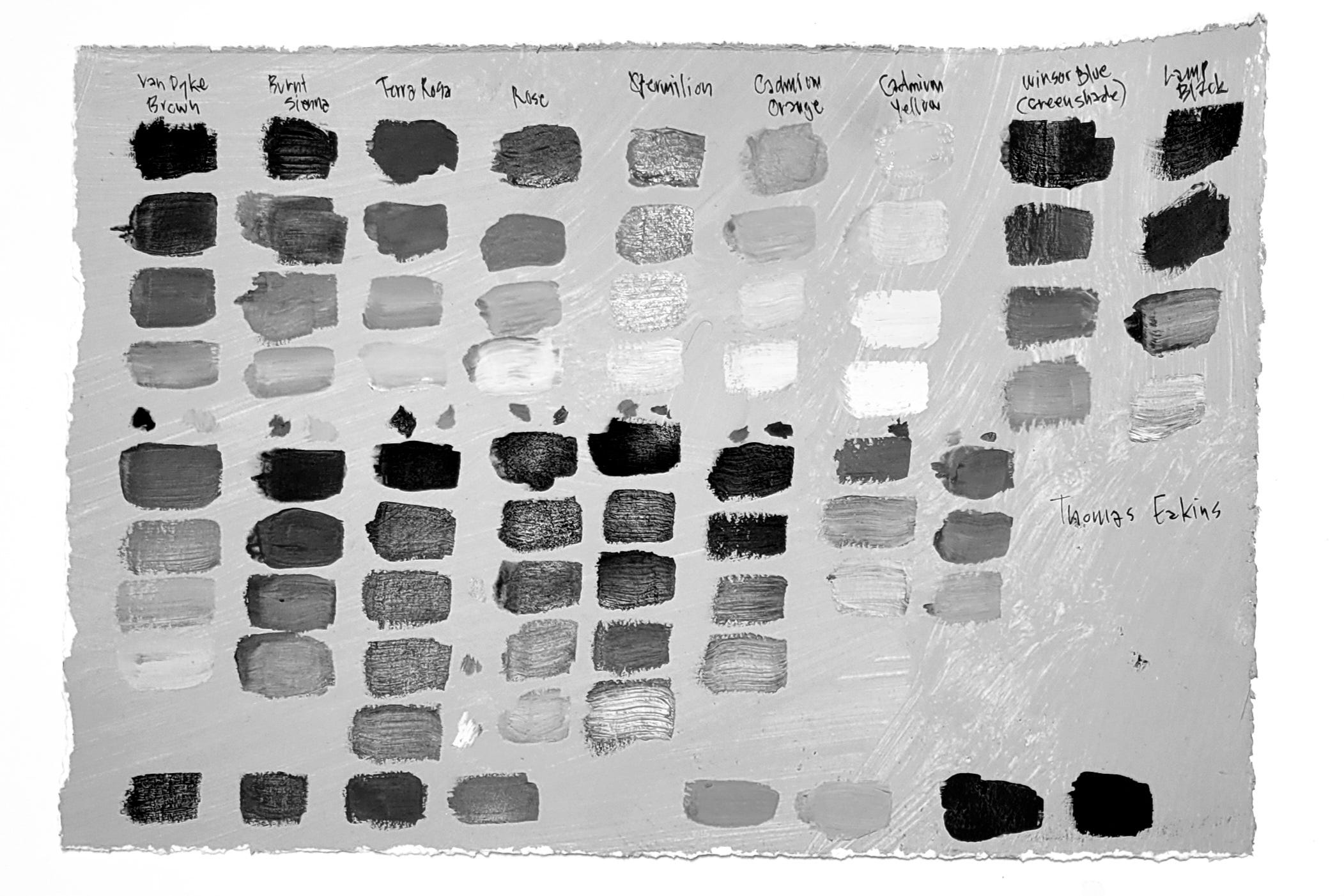
You can see in traditional palettes that artists had a strong understanding of color value. Photographing these palettes in black and white reveals the full range—from light to dark—and how well the palette supports contrast and depth in a painting.
These studies also connect me to the way paintings were made—what materials were available, how artists adapted, and what choices held up over time. Older palettes often had fugitive pigments but now companies like Winsor & Newton can recreate those colors in durable paint. Exploring them deepens material literacy, revealing how certain colors influence technique, subject matter, and what we think of as a ‘master work’.
Traditional palettes were also surprisingly flexible even with only a few colors. They worked across figure, landscape, and still life, and their continued relevance helps connect current practice to broader traditions in painting.
Eakins-inspired Palette
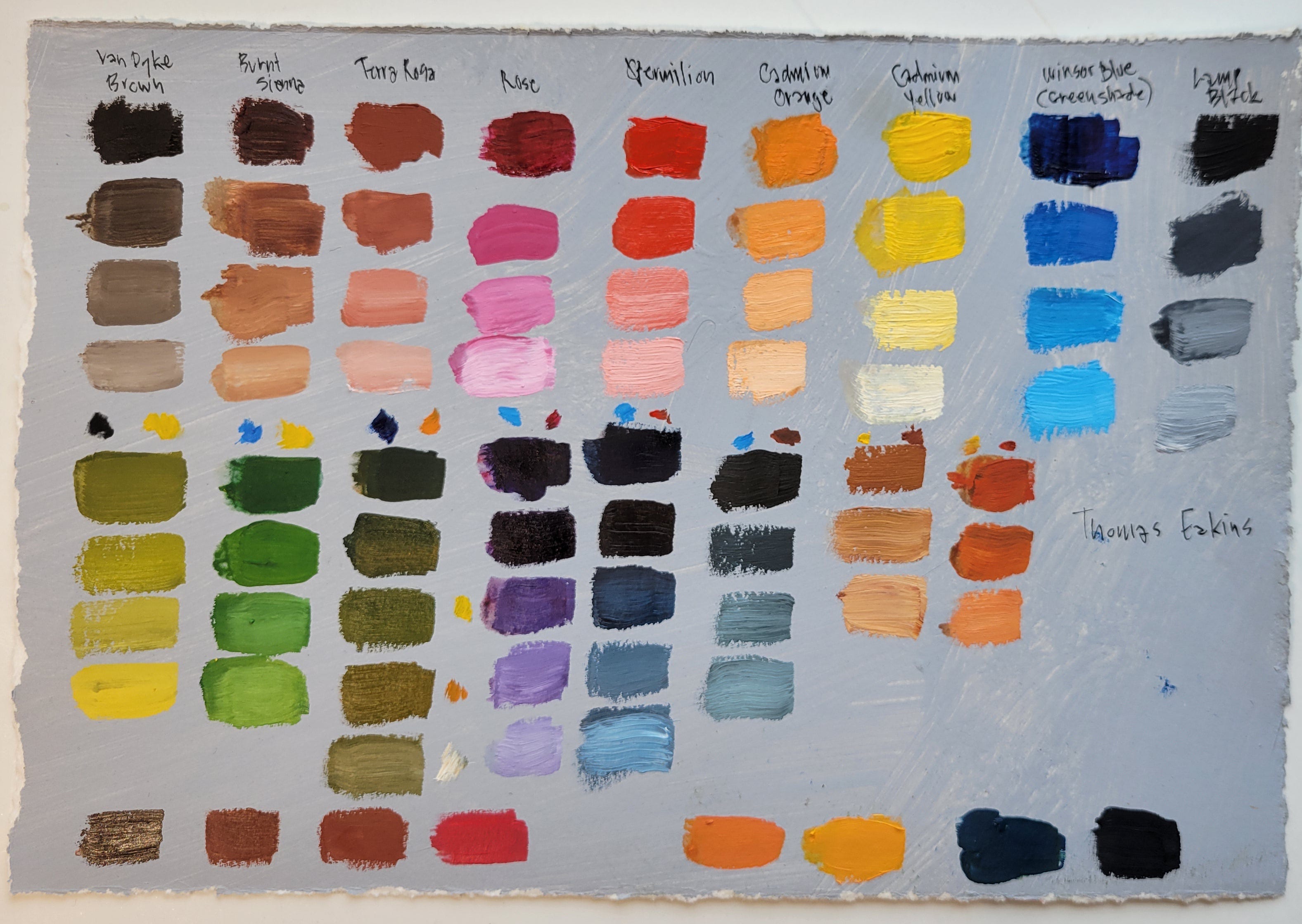
Thomas Eakins (1844-1916) [Link], was an American realist painter, photographer, and educator in Philadelphia associated with the Pennsylvania Academy of the Fine Arts and the Philadelphia Sketch Club [Link]. His work is still influential among figurative painters.
I started with a version of Eakins’s palette from Al Gury’s book Color For Painters [Link]:
Flake White (Lead White)
Lamp Black
Terra Rosa (substitute for Light Red)*
Winsor Blue Green Shade (modern equivalent for Permanent Blue)
Vermilion
Cadmium Orange
Cadmium Yellow
Van Dyke Brown
Burnt Sienna
Permanent Rose
*I didn’t have any Light Red on hand, so I used Terra Rosa instead. Later, I stopped by Artist and Craftsman [Link] to compare the two. Both are made from PR 101 (the international pigment source code), but Terra Rosa is slightly more orange. PR 101 can range from an earthy purple to a terra cotta pink-brick color depending on the pigment-to-binder ratio, and whether it has been oxidized or calcined—and for how long. I didn’t buy any Light Red as I think Terra Rosa is close enough.
You can watch the video of how I mixed a variety of colors using this palette.
Utilitarian Palette – Basic palette for any subject
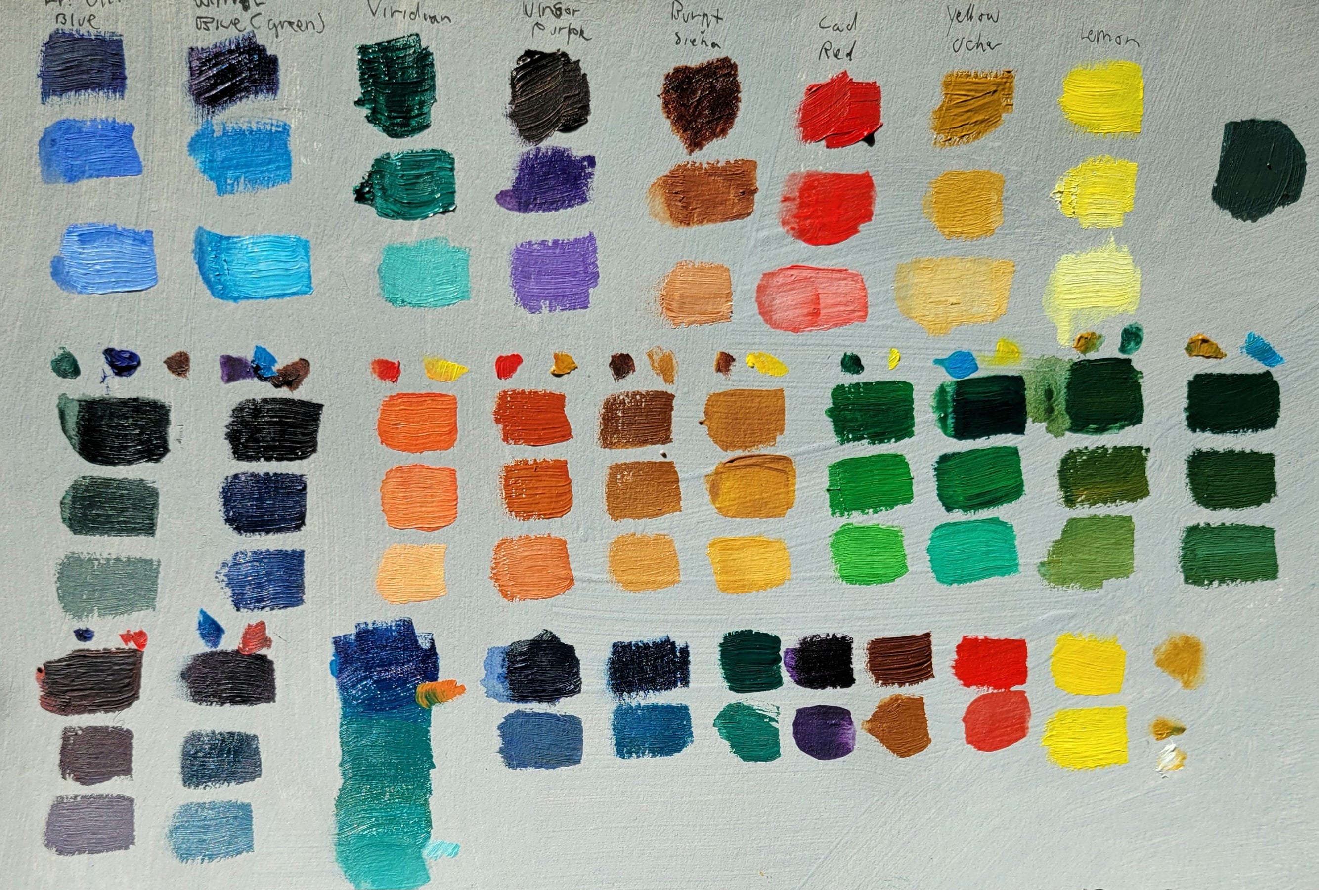
A versatile palette suitable for portrait, figure, still life, or landscape:
French Ultramarine
Winsor Blue (Green Shade)
Viridian
Winsor Purple
Burnt Sienna
Cadmium Red
Yellow Ochre Light
Lemon Yellow or Winsor Lemon
Compact and flexible. Good for travel. Strong green and orange mixes. The warm red can limit cool mixes, but it's workable.
Rembrandt-inspired Palette


Rembrandt van Rijn (1606-1669) was a Dutch Golden Age painter and printmaker working primarily in Amsterdam. If you look at the palette above, you might think that this cannot possibly be what Rembrandt used because we think of his work being primarily brown and dark. However, that perception is due to several factors: layers of old yellowed varnish, centuries of dirt, and pigments that radically darkened over the centuries. Were it not for the chemical changes in Rembrandt’s work, his work would appear to be much brighter and chromatic.
These were the colors Rembrandt used, according to pigment analysis by Jackson’s Art [Link]and The National Gallery (UK) [Link]:
Flake White
Burnt Umber
Burnt Sienna
Vermilion
Carmine Red
Lemon Yellow (substitute for Lead-tin Yellow or Nickel Yellow)
Stil de Grain (I used Williamsburg brand for accuracy)
Azo or Phthalo Blue (substitute for Azurite)
Smalt (similar to a muted Ultramarine Blue)
This is a beautiful, simple palette. Great value range. Strong earthy mixes. I plan to use it more for controlled, limited color work.
Landscape Palette
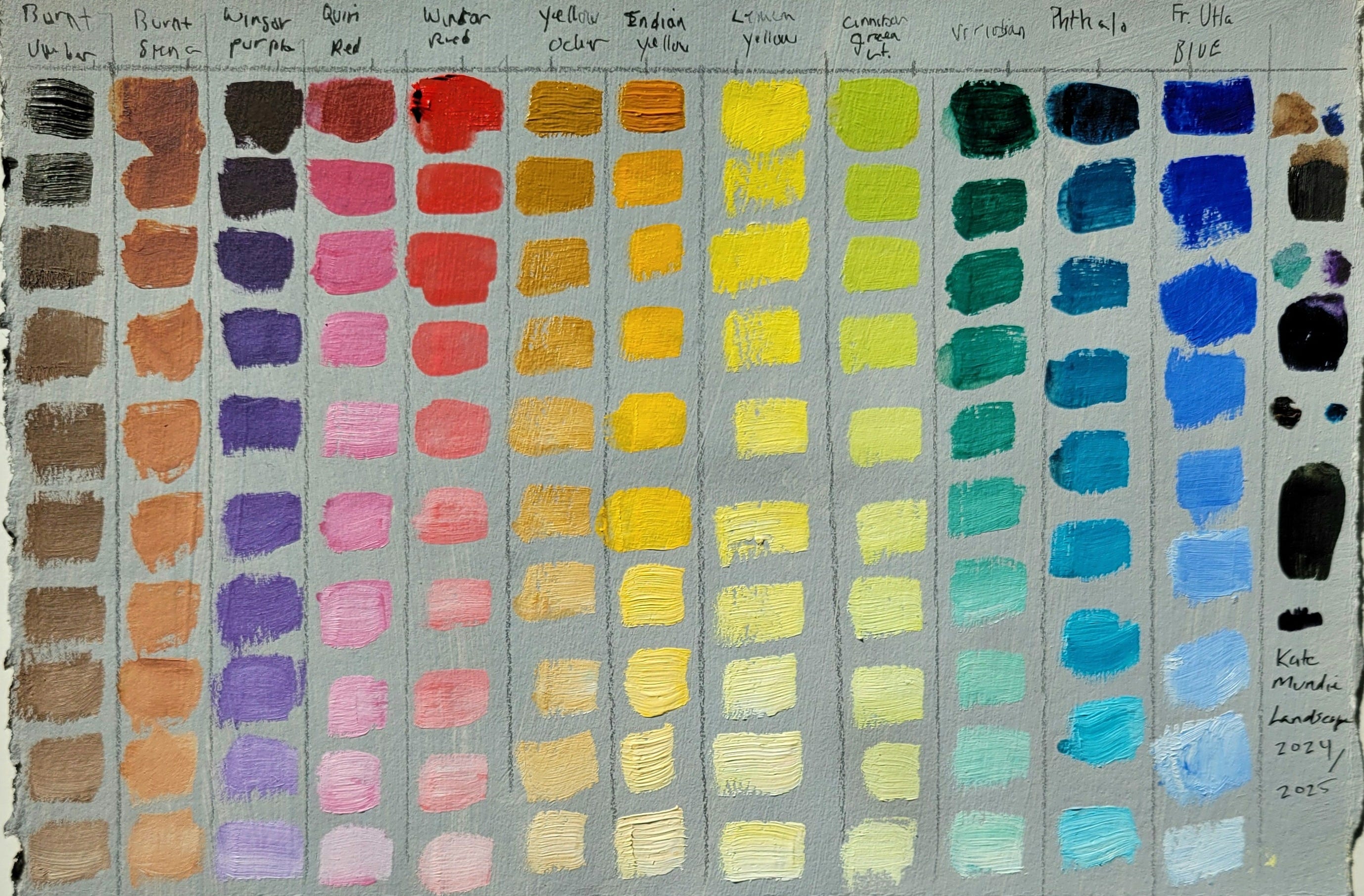
This is my current plein air setup:
Burnt Umber
Burnt Sienna
Quinacridone Red
Winsor Red
Yellow Ochre
Indian Yellow
Lemon Yellow
Cinnabar Green Light (Williamsburg)
Viridian
Phthalo Blue (might switch to Winsor Blue Green Shade)
French Ultramarine
Winsor Purple
Titanium White
This is a large palette with strong mixing options. Great for building subtle transitions and deep value contrast. I am adjusting the blue because Winsor Blue Green Shade feels more natural than Phthalo.
I’ve been photographing all my palettes in black and white to study value range. This one has a broad spread from light to dark, which makes it especially useful for plein air work in changing light.
Studying historical palettes connects technique, material, and tradition. These limited color sets reveal how artists worked with value, hue, and harmony—often with fewer tools than we have today. Reconstructing them sharpens my own color mixing, deepens my understanding of art history, and offers useful constraints for painting today.
If you are interested in seeing me work through another historical palette, let me know. I'm open to suggestions and curious what artists or palettes you would like to explore next.


Pear and Gorgonzola Risotto with Toasted Walnuts
Inspired by Chef Luca Corleone, adapted for home cooking
Like the discussion of pigments above, this recipe requires patience, skill, and a few simple ingredients to achieve a delicious result.
Serves two.
Ingredients:
1 cup Arborio rice
1 small onion, minced
2 ripe pears, peeled, cored, and cubed
2 oz (about 60 g) Gorgonzola or blue cheese, crumbled (reserve some for topping)
4 tablespoons butter, divided
1 tablespoon honey
1/2 cup white wine
3 cups stock (vegetable or chicken), kept warm
1/4 cup chopped and toasted walnuts
Salt, to taste
Olive oil, as needed
Instructions:
In a large pan, melt 2 tablespoons butter over medium heat.
Add the cubed pears and honey. Sauté until soft, about 5–7 minutes. Set aside.In the same pan, melt 1 tablespoon butter.
Add the minced onion and cook until softened, 3–4 minutes.
Add a splash of olive oil if the pan seems dry.Add the Arborio rice and toast for 1–2 minutes, stirring frequently.
Pour in the white wine and stir until mostly absorbed.
Add the stock in 1/2 cup increments, stirring constantly.
Wait until the liquid is absorbed before adding more. Continue until the rice is transparent at the edges and al dente.Reserve half of the sautéed pears for topping.
Mash or blend the remaining pears, then stir them into the risotto.Add most of the Gorgonzola, reserving a bit for topping. Stir to combine.
Add salt to taste, then stir in the last tablespoon of butter.
Cover with a tight lid, turn off the heat, and let rest for 5 minutes.
Serve topped with the reserved pears, Gorgonzola, and toasted walnuts.
If you enjoyed this post and want to support my work, feel free to leave a tip! Your support helps me continue sharing my art process, insights, and recipes, without the commitment of subscribing.
Finding Creative Ground is a reader-supported publication. To receive new posts and support my work, consider becoming a free or paid subscriber.
What a fascinating topic. Thanks!