


Breaking Rocks? No, Just Trying to Paint Them
Painting and text art critiques.


This summer, I set a personal challenge: to master painting rocks. It seems simple, but capturing rocks in paint, especially in an area known for its rocky shoreline, has always been tricky for me. With my latest painting, I finally felt like I was getting the colors and shapes just right.
When painting rocks, I focus on the shadows— the shadows help define the form and then I can add the lights. The colors of rocks above and below the tide line differ, as do the tones of the seaweed clinging to them. I found that creating dramatic shadows gave the rocks their solid, three-dimensional appearance.
The rising tide added another layer of complexity. Instead of crashing waves, the tide came in in gentle ripples, arching in mesmerizing patterns. I was fascinated by how the light moved along the edges of the ripples and how the colors in the troughs shifted depending on where they were in the arc. I wanted to capture that movement, but as the tide rose and the light shifted, I found myself racing against time. I was making good decisions, layering in colors, but every artist knows that moment when confidence fades, and you’re suddenly unsure of every stroke. Fortunately, my husband [link to Jim Mundie’s drawing from that morning] caught the exact moment I messed up in a series of photos he took of me painting on the beach.
Painting doesn’t have an “undo” button—something I often wish for. But as I sifted through his photos, I found one from just before the mistake. You might wonder why I didn’t just return to the beach to repaint. The truth is, no two days on the beach are alike. Plus, the top half of the painting was already where I wanted it, and revisiting the bottom could have risked undoing what was working.
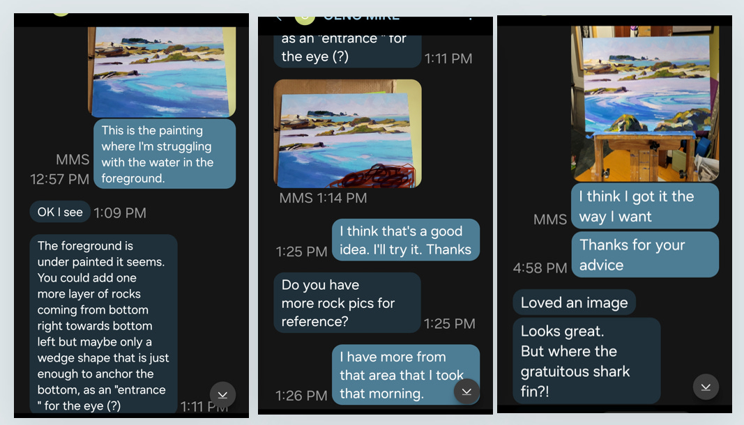
Back in Philadelphia, I visited Mike Geno’s studio and while talking shop shared my painting frustrations. I was pleased with the top part, feeling like I had finally hit my rock-painting goals, and even considered sawing off the bottom half of the panel. After sending Mike a photo of the piece after I got back to my studio, he texted me some thoughtful critique. So, I revisited Jim’s photos, brought the painting back to its pre-mistake state, and made the adjustments Mike suggested. In the end, I found a resolution that made me happy.
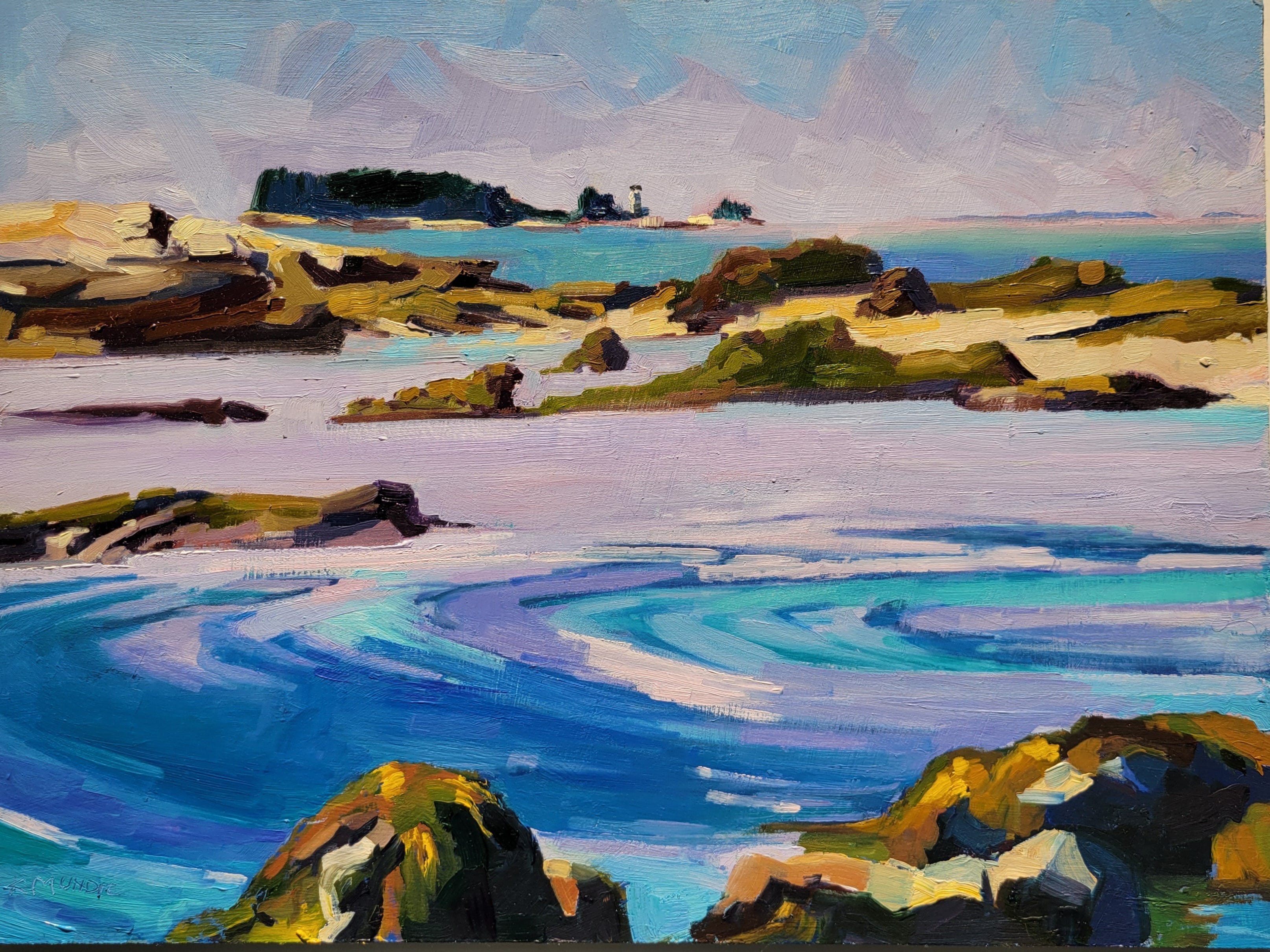
Great capture in above/below tidelines. Also the reflections in the shadows. The early impressionists realized that shadows are not just grey but have reflected colors.
I think you've come up with good solutions here. The rocks feel colorfully solid without being overly labored.