


Summer Painting Notes: Porter, Palettes, and a Demo Invite
Summer thoughts on Fairfield Porter, Revival colours, and making do with rotisserie chicken.

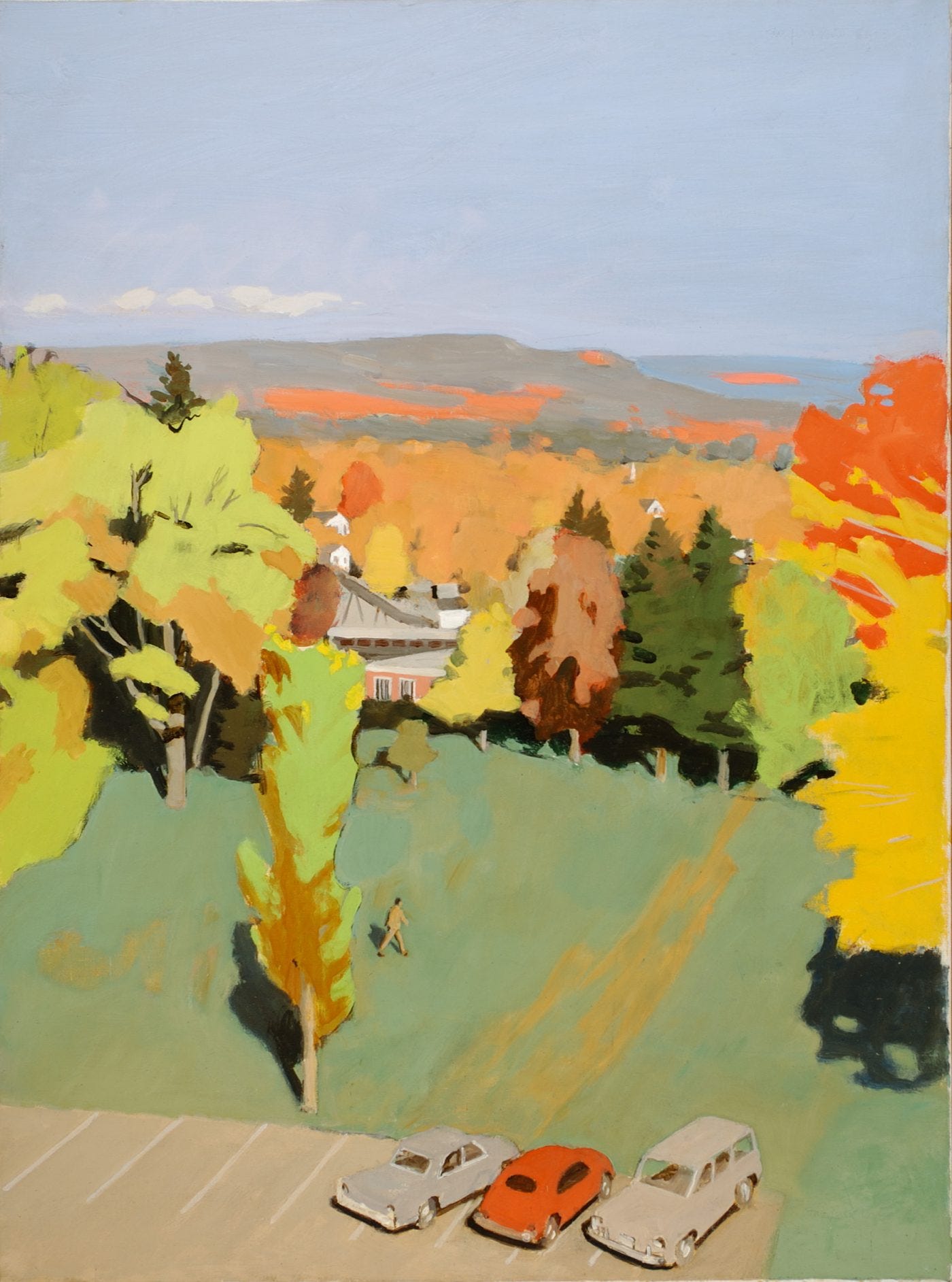
I’ve always admired Fairfield Porter’s landscapes—their flatness, their near-abstraction. I like his use of colour, pattern, and value. He captures the feeling of each season in the landscape he paints: not just the light or temperature, but the pace of the day.
He spent summers painting on Great Spruce Head Island in Penobscot Bay—just across the water from where I’ve been painting for years. So it’s natural I’ve looked to him for inspiration in the Maine landscape—especially when I’m trying to simplify a view or hold onto a mood.
Fairfield Porter (1907–1975) was born in Winnetka, Illinois, and educated at Harvard before training in painting at the Art Students League in New York. He was not only a painter but also a respected art critic and writer. Porter lived much of his adult life in Southampton, Long Island, in a community with other artists like Jane Freilicher, Larry Rivers, Robert Dash, Jane Wilson, and Paul Georges. He painted intimate domestic scenes, portraits, and landscapes. His brother, Eliot Porter, was a photographer whose work often explored a similar colour sensibility.
We don’t know exactly what colours Porter used. Some pigments from his time aren’t common today due to toxicity, and he likely added or dropped colours as his work evolved. In his letters, he mentions money being tight at times, so his palette may have shifted depending on what he could afford. He also had access to colours we might now think twice about, like lead-based whites, fugitive pigments, or industrial-grade enamel paints.
Reconstructing a Palette


What we do know is that Porter’s paintings feature a wide range of mustard yellows, rust reds, and brownish greens—colours that seem to land between green, brown, and yellow. They can seem unexpected, yet they work. After some experimenting, I started to see that those murky but beautiful greens and oranges aren’t easily made with the colours I typically reach for.
Take Raw Umber, for example. I haven’t touched it since art school. It always looked like rot—or worse. I’ve long preferred warm browns like Burnt Sienna, Burnt Umber, or Transparent Red Iron Oxide. They just feel more alive to me.
Cobalt Blue is another one I tend to avoid. It’s expensive, and it’s a neutral blue that can become grey if not mixed carefully. In Porter’s hands, it does the heavy lifting—creating atmosphere in his landscapes.
And while I used to use Alizarin Crimson in a lot of paintings in my twenties, over time I drifted toward warmer, more opaque reds. I now lean on Dioxazine Purple when I need something deep and punchy, rather than mixing purples.
However, if you’re trying to work like Porter, you have to let go of flash and learn to mix bold warm color from some neutral pigments. His colours are harmonious and strong and hum like a summer cicada.
My Fairfield Porter–Inspired Palette (W&N Artists’ Oil Colour)
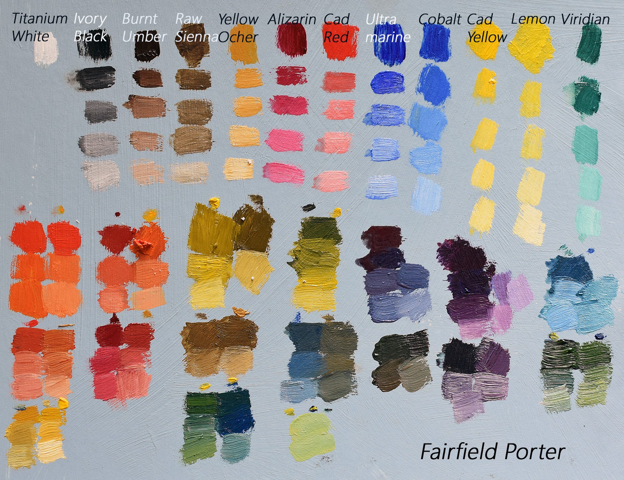
Titanium White
Ivory Black
Yellow Ochre
Cadmium Lemon
Cadmium Yellow
Burnt Sienna
Raw Umber (reluctantly welcomed back)
Cadmium Red
Alizarin Crimson (or Carmine)
Cobalt Blue
Viridian
I swatched Burnt Umber and Ultramarine Blue, but I don’t think Porter used those colours all that often. I would leave them out. After swatching and testing, the six colours that seem to do the most work in making a painting feel like a Fairfield Porter are:
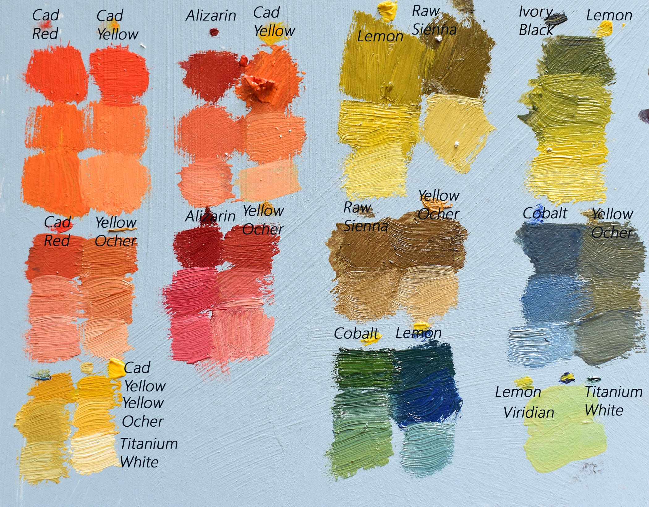
Yellow Ocher
Raw Umber
Cadmium Lemon
Cobalt Blue
Alizarin Crimson
Cadmium Red
They create those rich yet quiet browns, sour greens, and dusty pinks that feel like summer light on a porch, or the shadow cast by an Adirondack chair. I really love the combination of Alizarin Crimson and Yellow Ochre.
I’ve made a palette sheet showing how these colours interact. You can download below. I’ll be putting it to work soon on site at a couple locations I’m planning to paint on Deer Isle—just across the bay from where Porter once painted the same hills.
Why Bother with Someone Else’s Palette?
You might be wondering—why does it matter what paint someone used?
Most of what’s written about painters focuses on brushwork, subject matter, or their place in art history. Pigment choices rarely get much attention unless a museum is restoring a cracked surface or the artist left their colour mixing recipes behind.
Porter’s not exactly obscure, but he’s not Rembrandt either. He’s known in the US as a very American painter—and the kind of painter other painters tend to admire.
So why do I care?
Because a painter’s palette is a window into how they saw the world. What colours they trusted. What they left out. Whether someone is mixing with Cobalt Blue instead of Prussian Blue tells you something about how they translated the world from observation to canvas. That shift, from looking to painting, is what interests me.
It’s also practical. As a teacher, if a student wants to emulate a certain painter or try a particular look, I can help them build a palette that supports that. Not to copy, but to understand more about that painter’s technique. And for myself, reverse-engineering a colour I admire is one of the best exercises I know for improving my own ability to see and mix.
A Note on Porter’s Medium: Porter painted plein air and alla prima (at first attempt) on site in Maine. He used large hog bristle brushes and the Maroger medium—a toxic blend made from linseed oil cooked with white lead, and mastic varnish. Nasty stuff. But he needed a medium that allowed him to work wet into wet without the colours turning muddy.
These days, we can use something like Liquin Gel or Oleopasto for similar effects—without the toxicity.
If you've tried working from a historical palette, I'd love to hear about it. Or if you're a fellow palette nerd, tell me what you love to mix. I'll be sharing more about this project soon, including a painting demo in Maine using this Porter-inspired palette out in the field.
Cold Chicken with Green Herb Sauce


This is barely a recipe, but it feels like one. Start with a store-bought rotisserie chicken—serve it cold or room temp, with a generous spoonful of green herb sauce.
Ingredients
1 rotisserie chicken, cooled and carved into pieces
A few big handfuls of fresh herbs (parsley, basil, chives, tarragon, dill—whatever you’ve got)
1 garlic clove
1 small shallot or a few slices of red onion
2 scallions chopped
2 tablespoon Dijon mustard
1/2 teaspoon honey
2 tablespoons lemon juice and the zest of the lemon
splash of white wine vinegar
½ cup olive oil
Salt and lots of black pepper
Optional: capers or anchovies
Instructions
Make the herb sauce: In a blender, food processor, or with a knife and some patience, chop everything finely. Start with the herbs, then add garlic, shallot, mustard, lemon +zest, and oil. Season well.
Taste and adjust—more oil if it’s too tangy, or vinegar if it’s too flat. You want it punchy but not harsh.
Serve the chicken cold or room temp with the sauce spooned over. Add a green salad, cold potatoes, or some crusty bread if you need more.
🎨 Painting Watercolour Landscapes with Winsor & Newton Revival Colours with Plaza Art
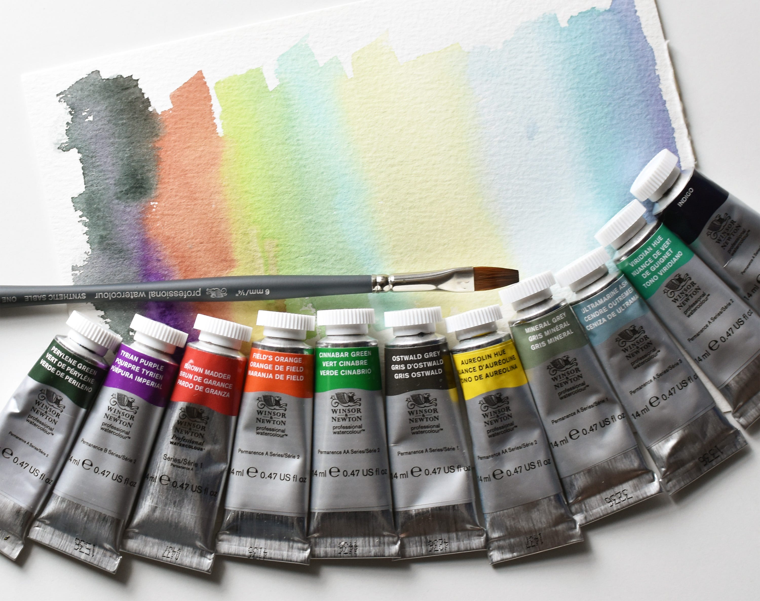
I’m teaching a virtual demo through Plaza Art on Thursday, July 11 from 1:00–2:30 PM EDT.
We’ll explore Winsor & Newton’s Revival Series Professional Watercolours—historic pigments with a fresh twist. I’ll walk you through a Maine landscape using atmospheric perspective and a limited travel palette. It’s a follow-along demo, so bring your brushes!
💵 Cost: $25
Registration includes a sample kit valued at more than the ticket price:
– 1 Winsor & Newton Revival Dot Card (8 little dots of paint to sample)
– 1 Professional Watercolour Synthetic Sable Brush (One Stroke ½")
– 1 tube of Designers Gouache (Permanent White, 14ml)
The brush alone retails for around $30. Whether you’re new to watercolour or looking to refresh your kit, this is a great way to try the Revival colours in action.
Can’t join live? A replay will be available on YouTube later.
Love this artists work!